

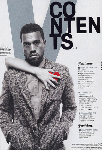
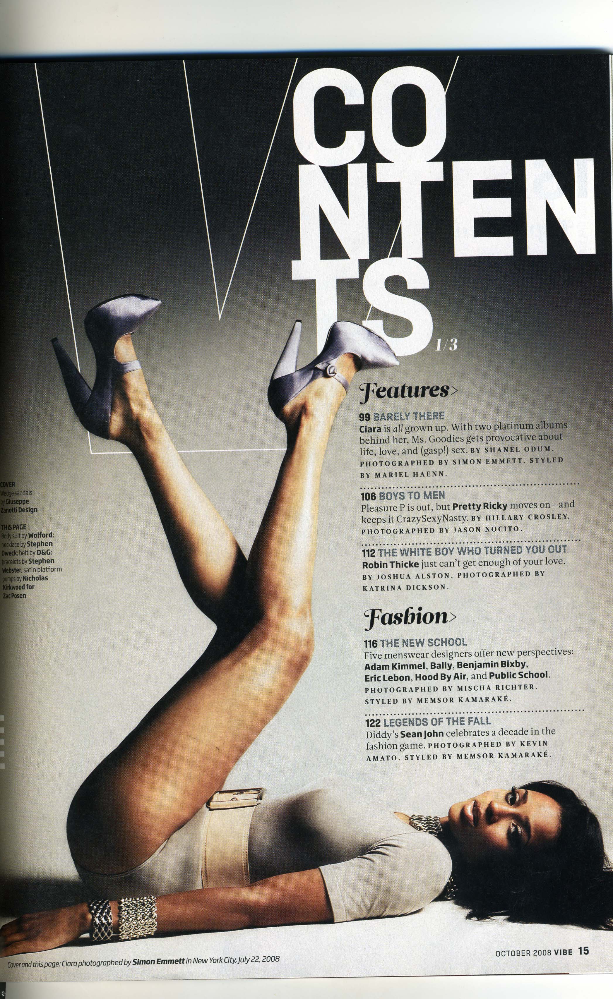
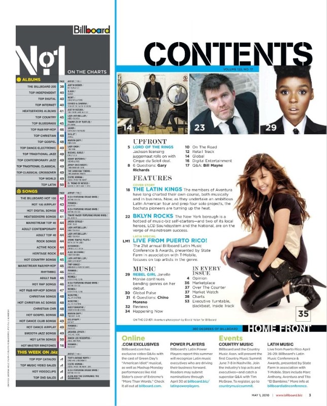


Common Conventions
- All pages have the use of images, with some using just one large image but others having 3/4 images ranging in size. This creates variety for the audience.
- The structure of all the magazines is that the contents is in columns with most just being on one side of the image. This makes it easier for the reader to see what is in the magazine and to quickly go to a particular page. The title of the page is often written in bold, with the anchorage text underneath in smaller writing.
- The contents heading is always at the top of the page. this is a common convention across all magazines.
- Page numbers are an important thing on the contents page as this helps the reader to know where articles are. Page numbers are normally displayed with just the number and not the word 'page' or 'p' in front of it.
- Most pictures have a small amount of anchorage text next to them to explain to the reader why that person is there.
- The colours on most of the contents pages are quite simple such as grey, white and black, with a pop of colour such as red or blue to brighten the page up.
- The fonts used on the contents pages are mostly very modern with a sans serif font in bold capital letters. however Q magazine uses a serif font which can be seen as old fashioned, also they have written it in lower case which is not the convention of a music magazine.
- Some contents pages such as the top right image, are shown in a double page spread which allows for more space for images and text. It brings emphasis to the main image more as this is often displayed over almost one full page.


