Wednesday 16 December 2015

Make up research

Here are a selection of images that I have found online that show celebrities with and without make up on. A lot of them look very different therefore, for my magazine, I am going to give my model more natural make up, without loads of blusher and eye make up. This will follow the conventions of Billboard magazine as their artists are mostly given natural make up and nothing too bold such as bright lipstick. Make up is used on artists for the magazine so that they look more attractive and appealing to the audience. It can make the audience feel like the celebrity is their aspiration if they look really nice on the front cover of a magazine.

Wednesday 9 December 2015

Research for the main image

I have done some research into the main image on the cover of magazines from my chosen genre such as Q and Billboard.
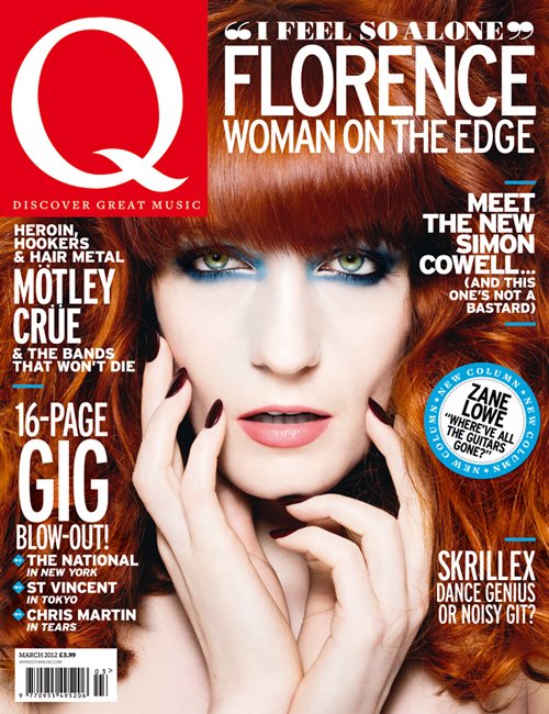
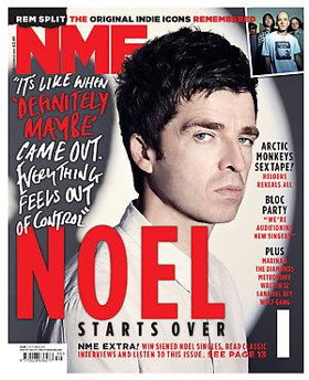
Each image has a direct mode of address, meaning they are looking into the camera, at the audience.
The images range in shot types with most being a mid shot however some are close ups which only show their facial expression and nothing of their body language. All of the images look to have a serious facial expression. This is because they are all looking into the camera with a straight face. Some of the images have their mouth open which indicates that they are ready to speak and engage with the audience.
Most of the images have their hand up which shows a motion or an action. For example, the top right image looks like she is adjusting her tiara and it adds another aspect and a focus point to the image. The top left image looks as if he is adjusting his shirt, as if to look smarter for the reader.
The colours on the magazine are mostly dull, like grey, black, white and brown however, most magazines have a splash of colour, like pink, blue, red and purple. Splashes of colour make that part of the magazine stand out to the audience.
The costumes on the images vary, this is because some artists are wearing very little, like the magazine 2nd to the left at the bottom. However, other artists wear more clothing such as Lady Gaga, this can represent her being more sensible and reserved and we see a different side to her normal extravagant exterior and behavior.
Representations show a soft side to pop artists in the bottom right image where she looks innocent. However, other representations can also be formed, such as Cheryl Cole looks quite evil and dangerous to approach.


Hand Drawn Designs- Contents

These are my mock up contents pages. They have been inspired by the research that I have done into existing magazines and they have been designed with my layout structure in mind.

Hand Drawn Designs- Front Cover


These are my hand drawn designs that I have done that are based on my layout designs. They both follow the conventions from the research that I have done. 

Monday 7 December 2015

Music magazine survey analysis - Graphs

These are my survey results that I have received from 6 different people via Survey Monkey. My results have shown,
-All of the people surveyed were 16-24 years old, who are part of my target market.
-Half of the people surveyed preferred going out with family/friends, 1/3 of people enjoy watching TV the most and 1/6 of people preferred listening to music the most.
-2/3 of people would prefer to read about the person on the front cover and 1/3 of people prefer to read about the latest technology in the industry.
-5/6 of people have never bought a music magazine before and only 1/5 people have bought a magazine a few times in the year.
-3/6 of people surveyed preferred the name Platinum, 2/6 of people preferred the name Influence and only 1/6 liked the name Rise.
- 1/2 of people would be willing to pay under £1 for a magazine and 1/2 would be willing to pay £1-£2 for the magazine.
-Out of the 6 people surveyed, 4/6 people like to listen to pop and 2/6 preferred 'other'. These were Indie Rock and House/Dance.
This has helped to decide on important decisions for the production and design of my magazine. Therefore, based on these results I am going to change my magazine name to Platinum rather than Influence becuase I feel it is more appropriate for a music magazine.

Thursday 3 December 2015

Masthead name ideas

Name ideas for my magazine

Power
Influence
Platinum
Rise
Chart
Definition
Academy
Upbeat
Revolution
Fresh

I have brainstormed a list of possible names for my music magazine. I have chosen these because I feel like they would suit a magazine for my target audience and genre.

Audience Research for my music magazine

https://www.surveymonkey.co.uk/r/KNDCS99


Wednesday 2 December 2015

Double Page Article Layouts


My article layouts feature everything a typical magazine would have such as pictures and text. The designs are displayed in different ways due to the location of the headings and images for example. My inspiration has come from my research into Kerrang magazine when I looked at the double page spread and it was very much like layout 3, where there was all text on one side and the image took up the whole other page with small sections of writing on it.

Contents Page Layouts


My contents page layouts have been influenced by looking at my research and what I know excising magazines do now. They are all different however they all have similarities such as the contents heading will always be at the top of the page.

Front Cover Layouts


My front cover layouts show a range of different designs and I have taken ideas from my research so that I can make appropriate decisions on the location of features for my magazine.

Tuesday 24 November 2015

My music magazine research- colour schemes

My research of Billboard magazine has shown that a lot of plain and basic colours are used as the background however there are splashes of colour that are used to catch the readers attention such as pink, yellow and blue. These are the colour schemes that I am going to use.

Monday 23 November 2015

House Style- Billboard front cover research

House Style is something that all magazines use to help the reader recognise the magazine straight away by using a similar layout and structure. This includes the masthead, the colours, the location of the main image and the anchorage text. It is an effective way of producing a magazine. I have noticed that Billboard changes the location of its masthead. It is normally on the side however for some special edition issues they put it on the left hand side. This shows a variety and this is something I will consider when designing my own music magazine.

Thursday 5 November 2015

School magazine evaluation questions


In what ways does your media product use, develop or challenge forms and conventions of school magazines?

My magazine looks like what a school magazine should, it has an image relevant to school, cover lines which are relevant and a title which is clear what the magazine includes. School magazines are supposed to be informative but also include images and text which are interesting to the age group of the reader and this is what my magazine includes. The image is general to the school as it is of students who have just received their exam results infront of the school building which is easily recognisable by all students who attend Plantsbrook School. 


https://www.powtoon.com/presentoons/d4VeiUGhyx3/edit/#/Publish/Details


What have you learnt about technologies from the process of constructing this product?


I have learnt how to create a front cover using fireworks which is new to me and something I’ve not used before. Fireworks has allowed me to add text and images to create a magazine and to use the different tolls that fireworks has. I have found this valuable as it has given me good experience about how to create a new magazine for the rest of the course. I have also learnt how to use cooltext and how to add it onto my magazine on fireworks and it will also help with many topics throughout media when choosing a title to put on a piece of work or another magazine. 

School Magazine Contents Page


Second draft with improvements
First draft of my school magazine

Monday 26 October 2015

Survey Monkey Graph Analysis- School Magazines


My Survey Monkey results show that people preferred the masthead of Design A and the main image of design A the most. This means I know what image attracts people to the magazine and it is a high quality image of a person.
The results show that 5/6 people (83.3%) would be attracted by a puff of a notepad to purchase the magazine. This shows that free 'stuff' is a factor as to what people look for when buying a magazine.
Graph 7 shows that the masthead and the puff are the most important features that people look for when buying a magazine.

Overall, my results show that Design A was the most popular and the features of the design were the best out of the 3 designs.

Wednesday 14 October 2015

2nd Draft Copies of School Magazine


These are my second draft copies of my school magazine. I have included different mastheads for each design. The layouts are different because of the position of the main image and where the cover lines are. The masthead is at the top of both magazines. The colours are similar with red, black and blue featuring in both magazine covers.  

Monday 5 October 2015

Masthead Designs

Masthead Designs 

Here are a list of mastheads that I have designed for my school magazine.

Design 1- This is appropriate to Plantsbrook School as the bubble writing is in red and there is the logo underneath. It is in bold writing which is clear to read. 

Design 2- This design is red dots and blue bubble writing. It is more colourful that the previous design and it is clear that it is a magazine with the word mag. 

Design 3- This design is more Gothic, as the colours black and red. it is in a rectangular shape with school PB written in the centre. The background is shaded in black.

Friday 2 October 2015


Created with flickr slideshow.
Photography so far

So far in photography, I have learnt different types of photos such as depth of field and how to recognize it. 
Also I have learnt what a visual lead in is and how it draws the viewers attention towards the main image or feature of the picture. This can be done by placing the image along a fence or at the end of a railway. 
Also there is the image of movement which means you take the image while the object is moving such as someone on a bike or in a car. This creates a good effect on the image and the viewer can tell that its moving. 
Created with flickr slideshow.

Monday 21 September 2015

School magazine analysis

Music magazine front covers


Music Magazine Front Covers 

Music magazines come in all different genres, Billboard for pop, Q is mostly rock and pop, NME for rock and Vibe for R&B. All the magazines have similar features, even if they specialise in different genres, these would include:

Bright and appropriate colours which are used on each magazine, the rock associated magazines use a lot of red which symbolises fear or death which some rock artists try to create. The pop magazines use a mixture of different colours which means creativity such as yellow, blue and purple. Bright colours will make the reader stop and look and it may attract them to purchase it.

The main image on each magazine is looking towards the camera, even if their face is in a different direction. This can mean that they want to interact with the reader and draw in their attention. All the magazines have anchorage texts which link to their main image to give a bit more information about the story inside. Each magazine also has at least 3 cover lines which details other stories inside the issue.

On 3 of the 4 magazine cover above, the masthead is being overlapped by the main image which can show that the image is more powerful and important than the name. Each masthead is at the top of the magazine and this seems to be a similar trend in the music magazine industry.

All of the images show no more than a mid-shot image, with Q magazine choosing a close up shot. This means that the attention is drawn to their face rather than their body or outfit. It means the image can have more of a connection with the reader if just the face is on show.

Music magazine cover analysis

Technologies


For the first part of my coursework, we were asked to try out some new technologies such as TubeChop. This is a site that allows you to adapt and manage YouTube videos so that they are more relevant to the blog that I'm creating. This allows for all the important information to come through without having any unnecessary parts of the video. It is easy to use and isn't complicated to understand how it works.

Media fire is a website that allows you to store and share all your types of media including photos, songs, videos and documents. You can access it from any device, mobile or computer so its easily accessible. Its helps me to be able to manage and develop my blog.

Tricider is a good app used in media because it allows you to brainstorm ideas and anything you want really and you get feedback from the people you know such as students and teachers. The website is slightly more confusing to use because the home page has much more information on it so its tricky to know exactly what it can do, however its a useful website to have.

Overall, I preferred TubeChop the best because it was very simple and an effective idea and I think it can be very useful to me in my AS Media Studies.