


Music Magazine Front Covers
Music magazines come in all different genres, Billboard for pop, Q is mostly rock and pop, NME for rock and Vibe for R&B. All the magazines have similar features, even if they specialise in different genres, these would include:
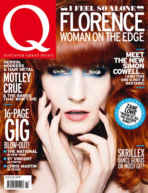
Bright and appropriate colours which are used on each magazine, the rock associated magazines use a lot of red which symbolises fear or death which some rock artists try to create. The pop magazines use a mixture of different colours which means creativity such as yellow, blue and purple. Bright colours will make the reader stop and look and it may attract them to purchase it.
The main image on each magazine is looking towards the camera, even if their face is in a different direction. This can mean that they want to interact with the reader and draw in their attention. All the magazines have anchorage texts which link to their main image to give a bit more information about the story inside. Each magazine also has at least 3 cover lines which details other stories inside the issue.
On 3 of the 4 magazine cover above, the masthead is being overlapped by the main image which can show that the image is more powerful and important than the name. Each masthead is at the top of the magazine and this seems to be a similar trend in the music magazine industry.
All of the images show no more than a mid-shot image, with Q magazine choosing a close up shot. This means that the attention is drawn to their face rather than their body or outfit. It means the image can have more of a connection with the reader if just the face is on show.
No comments:
Post a Comment